
Product · August 13, 2026 · 12 min read
Fresh Approach on User Profiles on Whistlr
Whistlr's profile redesign puts your video banner, Blip, and Mood up front. See what changed, which profile features to set up, and how to refresh your page.
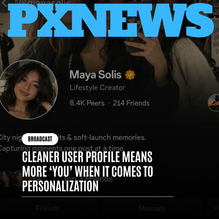
Whistlr's profile redesign rebuilds the layout of the page that represents you across the app. Instead of stacking a photo, bio, stats, and grid with equal weight, the new design leads with what is current and personal, your video banner, your Blip, and your Mood, and moves follower numbers into a supporting role. No new features were added; the redesign changes the order and hierarchy so the features you already use finally work together. Here is what changed, why, and how to make the most of it.
What Changed in the Whistlr Profile Redesign
The update is about structure, not a new list of settings. Everything you had set before carries over automatically. What is different is how the page decides what a visitor sees first.
- Presence leads: The video banner, your Blip, and your current Mood now sit together at the top as one coordinated header.
- Stats step back: Peer, following, and post counts remain visible, grouped and spaced as supporting detail rather than the headline.
- Bios get room: Your bio has its own clear space instead of being squeezed between buttons and numbers.
- Relationship status has a home: When two people have both confirmed a relationship, it appears near the top of the profile rather than buried further down.
- The grid stays familiar: Your posts and Minis remain in the same browsable layout, now beneath a stronger introduction.
There is nothing to migrate or switch on. Every existing account is already using the new layout.
Why the Old Profile Layout Felt Like a Résumé
The previous profile followed a pattern common across social apps: picture, name, handle, a short bio, a line of numbers, then an endless grid. It is a layout borrowed from credentials, where you establish who you are once and leave it alone. That works for a networking site. It fits poorly on a platform built around people whose lives, moods, and interests shift from week to week.
Everything Looked Equally Permanent
The biggest problem was that every element received the same visual weight. An old photo from years back carried the same authority as a Mood you picked this morning. A bio nobody had edited since sign-up took up the same prime space as a freshly confirmed relationship. Nothing on the page signaled what was happening now.
The Template Made the Choices
Because every profile followed the same stacking order, people could not let the most expressive part of themselves lead. Someone whose Blip and banner said the most about them had those elements competing with counters. The layout decided what mattered instead of the person whose page it was.
Numbers Took the Spotlight
In the old layout, counts sat high on the page, close to the name, where the eye lands first. That nudged visitors to judge a person by audience size before anything else, and it nudged people to judge themselves the same way. For someone with a small but close group of peers, the first message their profile sent was a number that said little about who they actually are. Moving stats into a supporting row is a small change on screen, but it shifts what a profile communicates: personality first, popularity second, if at all.
The New Profile Hierarchy, From Top to Bottom
The design principle behind the update puts presence ahead of credentials. Landing on a profile should feel like meeting someone, not like opening their file. Walking through the page in the order a visitor sees it makes that concrete.
The Header: Video Banner, Blip, and Mood
The page opens with your video profile banner playing behind the header, setting the tone before anyone reads a word. Your Blip, the short looping clip that animates your profile photo, sits in its circular frame with clear separation from the banner so its motion reads cleanly. Beside your name, your Mood appears as a small badge, a quick answer to how you are doing today. These three motion-based elements used to compete for the same few inches; now each has a defined place.
Relationship Context
Relationship status on Whistlr requires confirmation from both people before it appears. In the redesign, that mutually agreed detail sits naturally near the header. The feature itself works exactly as before; only its placement changed. You can read more in our article on relationship status features.
Bio and Personal Sections
Below the header, your bio has space to be read as a real statement about you. Personal sections such as About Me sit in a calmer part of the page where visitors who want to know more can find them.
Stats
Counts sit in a clean, evenly spaced row. They still give useful context, but visitors understand who you are before they see how many peers you have.
The Content Grid
The grid of posts and Minis works the way it always has. It did not need reinventing, only a more human introduction above it.
Meet the person first. Count the numbers later.
Profile Features Worth Setting Up Now
The redesign rewards the features that make a profile feel alive. If you have skipped any of these, now is a good time to fill them in. The Profile page gives an overview of each.
- Blip: An animated profile photo made from a short video. Your static photo stays as a fallback.
- Video profile banner: A moving backdrop for the top of your page. See our video profile banner guide for tips.
- Mood: A one-tap way to show how you feel today, displayed beside your name.
- Profile song: A track that represents you, playing on your page.
- Cruise Control: A longer playlist on your profile, with room for up to 40 songs.
- Top 8: Highlight the people who matter most to you.
- Show & Tell and About Me: Spaces to share more of your story and interests.
- Links: Send visitors to your site, shop, or other channels.
- Relationship status: Optional, and shown only when both people confirm.
Whistlr's profile editor also includes options for things like a cover, Halo, skins, and badges. If you are curious about the nostalgic side of customization, read Introducing Profile Skins: An Early Nod to the Early 2000s.
How to Refresh Your Whistlr Profile in One Sitting
Use the redesign as an excuse to update your page. This checklist takes you through it in order of what visitors see first.
- Record a new Blip: Keep it short, well lit, and recognizable as you. A small natural movement works better than something busy.
- Choose a video banner that sets a tone: Pick footage that is calm enough to sit behind text, such as a place you love or a slow moment from your work.
- Set today's Mood: It is the quickest way to make your page feel current, and you can change it as often as you like.
- Rewrite your bio: Say who you are and what people will find here in plain language. Read it aloud; if it sounds like a résumé, simplify it.
- Add a profile song: Music is one of the fastest ways to communicate personality.
- Update your Top 8 and About Me: Make sure they reflect your life now, not when you joined.
- Check your links: Remove anything outdated and put your most important destination first.
- Look with fresh eyes: Scroll your page as if you were a stranger arriving from one of your Minis, and trim anything that feels cluttered.
Profile Design Tips That Make a Strong First Impression
With the header now doing most of the introducing, a few small choices make a big difference. These tips apply whether you are a casual user, a creator, or a business.
Make the Three Header Elements Complement Each Other
Your banner, Blip, and Mood now appear together, so think of them as one composition. If your banner is busy and colorful, keep your Blip simple. If your Blip has a lot of movement, choose a slower banner. Contrast keeps each element readable instead of letting them blur into noise.
Keep Motion Gentle
Looping video catches the eye, but fast cuts or flashing light can feel tiring after a few seconds. Smooth, slow movement tends to look more polished and lets visitors focus on your name and bio.
Write the Bio for a Stranger
Your friends already know you. Your bio is for the person who just found you through a Mini or a comment. Tell them in one or two lines what you care about or what you post, and skip inside jokes that need context.
Update Little and Often
The new layout rewards a page that changes. Swapping your Mood, refreshing your banner with the season, or rotating your profile song are quick ways to signal that someone is actually home.
For Business Accounts, Lead With What You Sell
A business profile should answer "what is this and why should I care" within seconds. Use the banner to show your product or space in action, keep the bio specific about what you offer and where, and put your storefront link first. Visitors who arrive from an ad or a Boost have already shown interest, so make the next step obvious.
Privacy Controls That Shape What Visitors See
A more expressive profile does not mean a more exposed one. Whistlr gives you several ways to decide who sees what.
- Private account: Limit your content to approved peers.
- Close Friends: Share certain stories with a smaller, trusted group.
- Relationship consent: A relationship only appears when both people confirm it, so nobody can claim a connection with you on their own.
- Hide likes and limit comments: Turn off like counts or comments on individual posts.
- Online status and last seen: Choose whether others can see when you are active.
- Who can tag or mention you: Control how others can attach your name to their content.
- Lowkey: See who has viewed your profile.
Whistlr is an adults-only platform for people 18 and over, and these settings are designed to let adults present themselves on their own terms.
What the Profile Redesign Means for Creators and Businesses
For anyone building an audience, the profile is a landing page. Every Mini, whistle, comment, and ad points back to it, and it is where a curious viewer decides whether to follow you, trust you, or buy from you.
- First impressions convert: A visitor arriving from a Mini now sees your banner, Blip, and Mood before your numbers. That favors creators with a clear personality over those relying on size alone.
- Profile visits are a goal you can buy: Boost offers a "More profile visits" goal, and Ads Manager includes a Profile Growth objective and a Profile Visits optimization. A stronger profile makes that spend work harder. See Boost.
- Verification adds trust: Verified Creator and Verified Business badges tell visitors you are who you say you are. The Getting Verified page explains how to qualify.
- Links do real work: Put your storefront, booking page, or main site first so visitors who are ready to act can do it immediately.
- Measure the effect: The professional dashboard shows accounts reached and follower growth, including follows and unfollows by day, so you can see whether a refreshed profile changes how many visitors become peers.
Why ETAPX Treats Your Profile as Home Base
You rarely look at your own profile. You are busy in the feed, in messages, or on a live. But other people look at it constantly, usually at the exact moment they are deciding whether to follow you or respond to you. A profile that undersells you quietly undersells you everywhere else on Whistlr.
AJ, ETAPX's founder and CEO, has described the profile as the single space in the app owned completely by its user. Feeds, communities, and comment threads are shared spaces; your profile is yours. In his framing, the redesign was about making it finally feel that way, a home base rather than a form completed once and forgotten. That is also why the update leans on live elements. A home should feel occupied: Moods keep it current, Blips add motion, and a video banner turns it into somewhere you can picture.
For more on how ETAPX is approaching personalization, see A Cleaner User Profile Means More 'You' When It Comes to Personalization.
Frequently Asked Questions
What changed in the Whistlr profile redesign?
The redesign reorganizes the profile layout rather than adding new features. Your video banner, Blip, and Mood now lead the page together, stats are grouped as supporting detail, bios have more space, and mutually confirmed relationship status appears near the top.
Do I need to update anything to get the new Whistlr profile?
No. The new layout applies to every existing profile automatically. Your Mood, Blip, video banner, bio, and relationship status all carry over without any setup.
What is a Blip on Whistlr?
A Blip is an animated profile photo created from a short video that plays as a loop. Your regular profile photo remains as a fallback wherever animation is not shown.
How does relationship status work on Whistlr?
Relationship status only appears once both people have confirmed it, so nobody can list a connection with you without your agreement. The redesign changed where it shows on the profile, not how consent works.
Can I hide my follower count or likes on Whistlr?
Peer counts are part of the profile's stats row, but the redesign places them below your header so they are less prominent. You can hide like counts on individual posts and make your account private if you want more control.
Why does a good profile matter for businesses on Whistlr?
Your profile is where Minis, posts, Boosts, and ads send people, so it shapes whether visitors follow or buy. A clear header, strong bio, and well-ordered links make paid and organic traffic more likely to convert.
Your Whistlr profile has always been the center of who you are in the app, and the redesign finally gives it a layout to match. If you have not looked at your own page in a while, open it, set a fresh Mood, and see how it introduces you now.